This is a documentation for Board Game Arena: play board games online !
Tutorial reversi: 두 판 사이의 차이
Sourisdudesert (토론 | 기여) |
Sourisdudesert (토론 | 기여) |
||
| 106번째 줄: | 106번째 줄: | ||
Explanations: | Explanations: | ||
* With "position: relative" on board, we ensure square elements are positioned relatively to board. | |||
* For the test, we use a red background color for the square. This is a useful tip to figure out if everything is fine with invisible elements. | |||
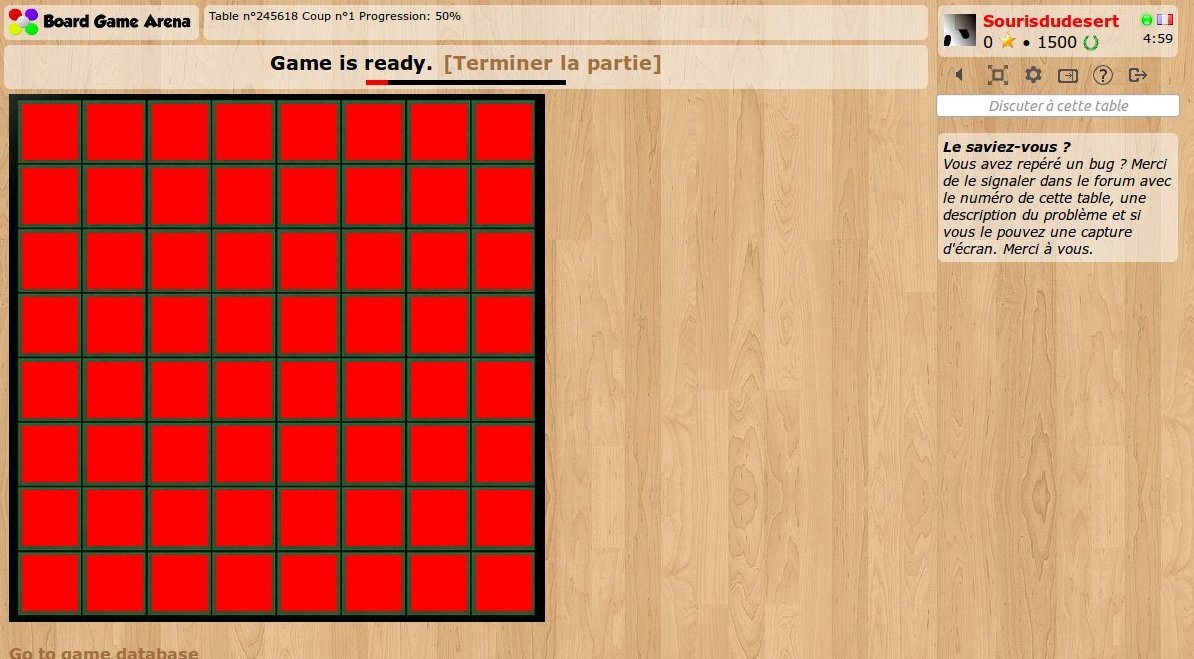
Let's refresh and check our our (beautiful) squares: | |||
[[File:reversi2.jpg]] | |||
2012년 11월 24일 (토) 14:50 판
Introduction
Using this tutorial, you can build a complete working game on BGA environment: Reversi game.
Before reading this tutorial, you must:
- Read the overall presentations of the BGA Framework (see here).
- Know the rules of Reversi.
Create your first game
With the initial skeleton of code provided initially, you can already start a game from the BGA Studio. For now, we are going to work with 1 player only. Most of the time this is simpler to proceed with only one player during the early phase of development of your game, as it's easy and fast to start/stop games.
Thus, you can start a "Reversi" game, and arrive on a void, empty game. Yeah.
Let it look like Reversi
It is always a good idea to start with a little bit of graphic work. Why? Because this helps to figure out how the final game will be, and issues that may appear later.
Be careful during designing the layout of your game: you must always keep in mind that players with a 1024px screen width must be able to play. Usually, it means that the width of the play area can be 750px (in the worst case).
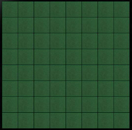
For Reversi, it's useless to have a 750x750px board - much too big, so we choose this one which fit perfectly (536x528):
Note that we are using a jpg file. Jpg are lighter than png, then faster to load. Later we are going to use PNGs for discs for transparency purpose.
Now, let's make it appears on our game:
- upload board.jpg in your "img/" directory.
- edit "reversi_reversi.tpl" to add a 'div' for your board:
<div id="board">
</div>
- edit your reversi.css file to transform it into a visible board:
#board {
   width: 536px;
   height: 528px;
   background-image: url('../../img/reversi/board.jpg');
}
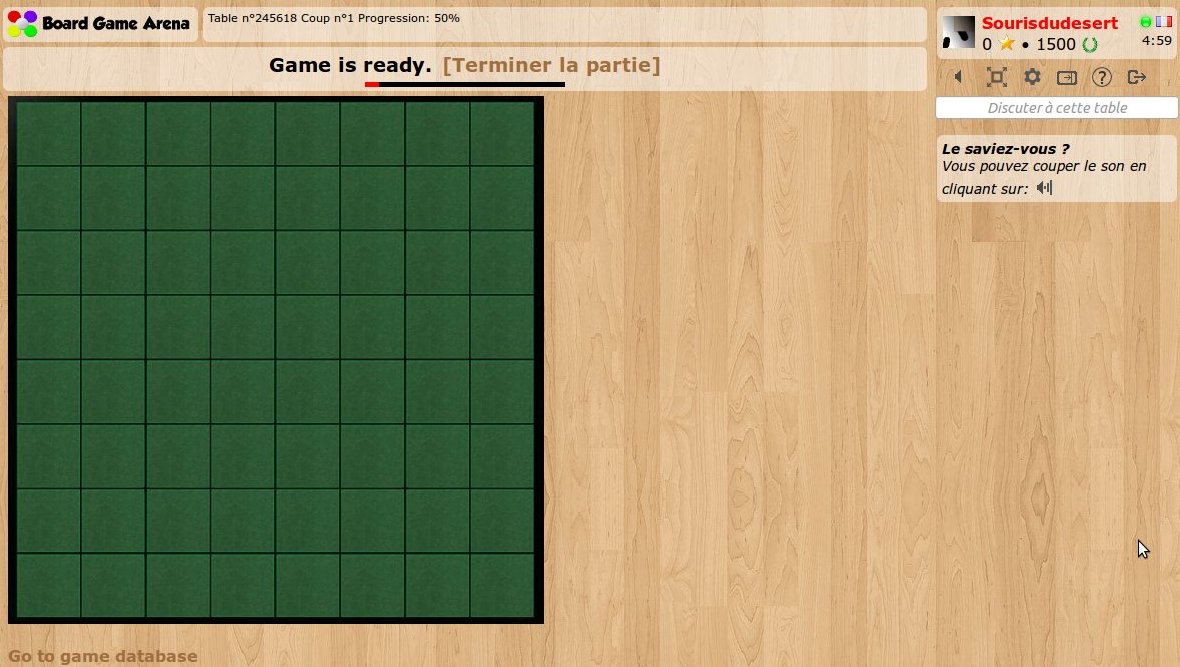
Refresh your page. Here's your board:
Make the squares appears
Now, what we need is to create some invisible HTML elements when squares are. These elements will be used as position references for width&black discs. Obviously, we need 64 squares. To avoid writing 64 'div' elements on our template, we are going to use the "block" feature.
Let's modify our template like this:
 <div id="board">
    <!-- BEGIN square -->
        <div id="square_{X}_{Y}" class="square" style="left: {LEFT}px; top: {TOP}px;"></div>
    <!-- END square -->
 </div>
As you can see, we created a "square" block, with 4 variable elements: X, Y, LEFT and TOP. Obviously, we are going to use this block 64 times during page load.
Let's do it in our "reversi.view.php" file:
        $this->page->begin_block( "reversi_reversi", "square" );

        $hor_scale = 64.8;
        $ver_scale = 64.4;
        for( $x=1; $x<=8; $x++ )
        {
            for( $y=1; $y<=8; $y++ )
            {
                $this->page->insert_block( "square", array(
                    'X' => $x,
                    'Y' => $y,
                    'LEFT' => round( ($x-1)*$hor_scale+10 ),
                    'TOP' => round( ($y-1)*$ver_scale+7 )
                ) );
            }
        }
Note: as you can see, squares in our "board.jpg" files does not have an exact width/height in pixel, and that's the reason we are using floating point numbers here.
Now, to finish our work and check if everything works fine, we are going to style our square a little bit in our CSS stylesheet:
#board {
    width: 536px;
    height: 528px;
    background-image: url('../../img/reversi/board.jpg');
    position: relative;
}

.square {
    width: 56px;
    height: 56px;
    position: absolute;
    background-color: red;
}
Explanations:
- With "position: relative" on board, we ensure square elements are positioned relatively to board.
- For the test, we use a red background color for the square. This is a useful tip to figure out if everything is fine with invisible elements.
Let's refresh and check our our (beautiful) squares:


